Assessing the Treetops Room

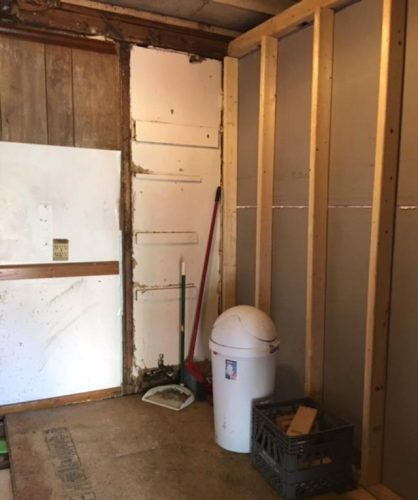
When I adjusted the door in our back bedroom so it would close completely I noticed some problems that must have occurred in relation to the renovation to the house back in 2013.

We need to clear enough clutter to patch and paint the room.

Under a back window is a significant crack much like the one in the pink bathroom which we repaired.

Charlie is our spackling expert.

We have inspected the entire room and have found cracks in the ceiling as well as under the window.

Clutter has been removed and artwork has been taken down from the walls.

In order to address these problems all clutter (YIKES!!) must be has been removed.  The only items that remain are large furniture, a TV, and a lamp.

Hoping the new color (left) will brighten up the room. (New color is a Sherwin-Williams website mock-up.)

Then we’ll:

  • apply joint compound to the cracks,
  • choose a new paint color for the walls (Spinach White) and ceiling (use something I have on hand),

    Spinach White is brighter and bluer than than the gray-green that’s there now.

  • paint the walls and ceiling,
  • touch up the trim paint, and
  • ready the room for guests.

This is a long term goal that will make its way into a few months of plans.

Jo

Dinner Party Décor

I had planned a dinner party with a  Thai friend as the chef so  I worked on the color theme, table settings, and décor with Thailand as an inspiration. Ultimately my chef was unable to cook due to an injury but the theme remained albeit not in the cooking which I ended up doing myself.

We invited by phone but sent a “pour memoire” card early in the week to remind date and time.

  • Colors: Saffron yellow, bright yellow, white, aqua green, olive green (which went with my caftan)
  • Flowers – yellows and white
  • Table cloth —  white with paisley runner

    The table runner tied the color scheme together.

  • Candles — our dining room is dark without candles
  • Dishes – Esteem by Noritake — aqua and brown

    My grandmother’s Noritake Esteem from the mid-1050s – turquoise, brown, and gold on white.

Saffron colored ranunculus, yellow and white mums and Billy balls (craspedia)..

I bought yellow and white mums and ranunculus at Trader Joe’s and picked some daffodils from the yard.  I scattered flower arrangements all over the house.

The table was set with place plates that I picked up at a local Goodwill store.

I used a white linen tablecloth with an aqua, gold, and green paisley runner accented by pale yellow linen napkins.  The day had been cold and dreary so I lit a lot of honey-colored candles on the table.

The first course plate was placed on top of the place plate.

I pulled together my dishes (including serving dishes) and silver flatware for the various courses. For a little variety I had purchased 8 turquoise plates at Goodwill  for $1 each to use as service plates on the table before we started the meal.  The first course was served on smaller plates put on top of these place holders.

Sparkly glassware looks nice in candlelight.

The glasses were a mixed set of long-stemmed water glasses and short-stemmed beverage glasses in which we served our home-invented Glade Fizz.

All dishes and courses were staged in the kitchen — ready to go.

Dessert was also served in stemmed glasses.

Demitasse and biscotti after dinner.

We had a cheery meal and spent some lovely time with special friends.

Jo

Scarf from Scraps

Lately I’ve been working on a few easy knitting projects.

I bought this handmade Icelandic sweater (lopapeysa) when we visited Iceland.

In my knitting history I have made many sweaters but I now opt for smaller, simpler projects like hats and scarves.

The hat (on the left) I knit a few years ago goes well with the lopapeysa.

I’m trying to use up my old bits of yarn some of which are at least 40 years old.  I had almost a whole skein of bright turquoise blue but not quite enough to make a scarf.

These balls of old yarn were in my stash.

I checked my yarn bin for other colors that might augment the turquoise and found other blues, creams, and greys.

The leftover colors were separated by 6 rows of bright turquoise.

Using a seed stitch (knit one, purl one) on an uneven row of 33 I alternated colored stripes until I ran out of bright turquoise. One benefit of seed stitch is that the garment lies flat.

I added fringe also using leftover yarn.

I trimmed the fringe to an even edge.

After finishing the knitting I had enough leftovers to make a generous multicolor fringe.

The entire scarf is about 6 feet long.

I like a long scarf that I can wrap around my neck multiple times.

While it doesn’t exactly match the beautiful Icelandic wool of my lopapeysa, I wear them together to stay warm.

The striped scarf “goes with” my lopapeysa.

Jo

Welcome Mat Uplift

This is how the mats looked when I first purchased them.

In 2017 I bought polar bear welcome mats.

The mat on the front porch in December, 2020 still looked pretty good.

I have been using them on the porches at the front and side doors.

My poor white bear has succumbed to many foot wipings.

When I got them out this year they looked plain grungy — even after cleaning them as best I could.  They were still in substantially good shape but the design was wearing off.

I did not purchase paint — I have lots of colors in my supply cache. (These were not the colors I used.)

I decided to try my go-to rescue technique — spray paint. I already had white and turquoise on hand so there was no cost involved.

See what I mean by “carelessly”?

First I carelessly (not a typo) taped around the outline of the bear with masking tape. Then I sprayed the bear until he/she looked white again. ( I had to wait for a day above 50 degrees to paint in order to get best results.)  Before removing the tape I also sprayed the rest of the mat with turquoise.

I corrected overspray with a localized hit of the opposite color.

I removed the tape and, carefully this time, touched up both the turquoise and white.

I think the whole project took less than 10 minutes.

And voila!

The polar bears don’t know that their color supports the Aloha theme inside the house.

Now the mats are back to work keeping shoe dirt out of the house.

Jo

Aloha Spirit Christmas

‘Aloha’ is more than a word of greeting or farewell or a salutation. ‘Aloha’ means mutual regard and affection and extends warmth in caring with no obligation in return. ‘Aloha’ is the essence of relationships in which each person is important to every other person for collective existence. ‘Aloha’  means to hear what is not said, to see what cannot be seen and to know the unknowable.” Pilahi Paki

The Aloha Spirit is everything we want at Christmas.

While in Hawaii I bought a sarong which Charlie thought I would wear as a beach cover-up.

I’m not really a sarong kind of gal.

My plan, however, was to use it as a tree skirt at Christmas. Since we might not have a large tree this year I’ll use it as table dressing in the dining room.  It’s predominantly red with a turquoise figure throughout. (I had recently used this color scheme at a party.)

I laid the sarong out on my bed and piled any Christmas items from the attic that seemed to go with it.

I decided to change up my go-to scheme of blue, green and silver to include red — bright red.

I was surprised by all the items that fit into this new color scheme from my stash of goodies.

Then I went to the internet for more inspiration.

Aqua, green, and red wreath.

Careful gift wrapping could make the scheme come alive.

My vintage winter wrapping paper in the aloha-theme colors.

This tree topper reminds me of a pineapple.

Christmas is almost here and the house is starting to get that Aloha look just in time to welcome guests.

The Red Wing stag on the mantel has his aloha colors on.

Also on the mantel is a small ceramic tree I “rehabilitated” a few years ago.

Turquoise and red in the conservatory adds to a whole-house Christmas.

I’m sure Charlie — a great lover of Christmas décor — will love the Aloha theme this holiday season.

Jo

Falling: A Color Change

Although my favorite color is blue and I usually have a blue theme going on in every room of the house, this fall I decided to make a temporary change.

I went out to the garden and found these dried-on-the-bush hydrangeas that had turned from pale pink to deep wine.

As I looked through cupboards and closets I found lots of warm — reds, oranges, and golds — objects to scatter around the house.

The small orange vase and large terra cotta fish platter anchor the warm palette — pale purple asters are from the yard.

I began with the living room mantel. An orange vase with purple hearts led me to a theme of warm colors highlighted with lavender.

Simple additions change the season in the living room.

An Asian-style coffee pot with warm and golden tones and a handmade pottery bowl in oranges and tans draw the eye around the room. I also covered a couple of throw pillows on the sofa with Hermes orange pillow slips I had made for this party.

Seasonal towels are an easy way to give a boost of color to the kitchen.

In the kitchen I pulled out dish towels that had been gifts from special friends.

Our food storage baskets tie into the color scheme as well.

The towels look nice with my collection of baskets that hold fresh produce, especially apples.

I know these flowers appear purple and yellow but they are deep red and orange in person.

Finally I bought a flat of pansies in 2 colors — deep red and orange — for Charlie to scatter around the property when a little color is needed.

Autumn colors are brilliant.

Mostly nature does its own thing outside and lights up the entire yard.

Jo

Keep on Truckin’ Retirement Party

On the first of September our Sug is retiring from her job as a truck dispatcher.

We have a theme!

If you knew Sug it would be ridiculous to think that she’s just going to take it easy.

Retro casual:  Men think Kingston Trio or the Beach Boys. Ladies almost anything goes.

We’re hoping many of her friends and colleagues will join us for an outdoor picnic-type event.

Inspired by this photo I chose a palette of red and turquoise.

This color combination is simple and effective.

The party area will be keyed to these colors as will our clothing. I’m hoping others will catch on.

Party pillow in new colors.

As usual for an outdoor party I recovered the occasional pillows in the party theme colors.

We’re planning an early evening party in early September.

The menu (see below) is intended to appeal to a variety of people.  I’ll make the sliders in advance and Charlie will man the hot dog grill.

Menu

  • Sloppy Joe sliders
  • Ham and cheese sliders  

    Ham and cheese slider made on Hawaiian roll.

  • Hot dogs grilled to order
  • Hot dog bar with all the fixings  — ketchup, chili, cheese, relish, mustard, onions
  • Individual bags of chips

    Individual bags of chips help alleviate COVID transmission concerns.

  • Individual cole slaw
  • Individual Amish macaroni salad (Charlie’s request)
  • Lemonade, iced tea, water
  • Mini Apple Pies (Sug’s dessert request)

    We’re serving individual pies in lieu of a large cake.

  • Lemons with peppermint sticks (a Baltimore summer staple)

    It’s a regional thing.

  • Lindy’s Italian Ice — red and blue

    I’ll definitely be looking for food in the party theme colors.

  • Blueberry saltwater taffy

    Love these individually wrapped candies.

  • Anise squares 

These are the plans.

Everybody loves a party favor.

I have a few more ideas up my sleeve but they will remain a surprise for now.  Invitations are set to go out the second week of August.

Jo

Sprucing Up an Outdoor Shutter

A few years ago I repaired, painted, and rehung all the exterior shutters on the house.

The shutter on the small ground floor window needs some TLC.

I even cut down one of the standard shutters to fit a newly installed over-the-counter kitchen window.

The kitchen window looks bare without a shutter.

This shutter seems to get more wear and tear than the others — probably due to its unprotected position in the afternoon sun.

Charlie did much of the scraping and cleaning.

More bare wood was apparent than I had anticipated.

After removing it from the house (which I had hoped I wouldn’t need to do) Charlie scraped off all the old chipping paint and as much rust as possible.

Rustoleum Rust Reformer helps to protect metal.

I then primed the rusty metal with Rustoleum Rust Reformer.

Primer was brushed onto worn areas.

Areas of bare wood were primed with Kilz primer.

We let the shutters dry for a couple of hours and rehung them before it started raining.

After priming the metal and wood I brushed on the original custom paint color to repaint first the back then the front side of the shutter and the metal.

Charlie pinned the shutters back into place.

This very noticeable shutter is now proudly rehung.

Every little repair/improvement is a commitment.

Jo

Painting the Shore House Kitchen — FINALLY!!

We’ve been working on the kitchen at the shore house for almost 2 years.

New drywall on ceiling, old lighting fixture.

After joint compound has been applied to ceiling.

My son installed the drywall on the ceiling in the kitchen, then we hired a man to mud the seams and repair any messy spots in corners.

The trick was to level the floor and match it to the existing floor.

Floor tiles will go in after the ceiling and walls are painted.

He and my son also finished installing the subfloor so it would be both level and sturdy.

The eat-in side of the kitchen was rotten and moldy from the water leak.  We removed this back wall to give more kitchen space.

A messy corner in the kitchen.

The messy corner drywalled and mudded.

The same corner primed.

Then my son primed the walls and ceiling in advance of a visit from Sug and me.

Mount Saint Anne is a slightly denim blue color.

I chose Benjamin Moore’s Mount Sainte-Anne for the ceiling — the same color we used on the living room ceiling.  My reasoning was two-fold:

  1. Matching the living room color would tie the two rooms together visually.
  2.  The kitchen ceiling is low compared to the rest of the house and blue is a receding color which will help to visually raise the ceiling.

Simply White for the kitchen walls.

The wall color is Simply White also by Benjamin Moore which ties into both the vintage white tile on the backsplash and the creamy cabinet we found on Facebook Marketplace.

After the back wall was removed we lost a cupboard in the kitchen and a closet in the bathroom but gained some kitchen floor space.

Now the walls are Simply White and the ceiling is Mount Sainte Anne both by Benjamin Moore.

What an improvement.

Here’s the remaining task list not necessarily in this order:

  1. Lay peel and stick floor tiles.

    Tiling the floor will be a huge upgrade.

    These tiles will lighten the entire kitchen which only has one outside window

  2. Add cove molding above the cabinets. 

    Cove molding will fill in the gap above the cabinets

  3. Add baseboard near the floor. 

    After flooring is installed baseboard molding will fill in the gaps.

  4. Add cornice molding around the rest of the room. 

    Trim will help finished this vintage kitchen.

  5. Replace the range hood. 

    A new range hood would help complete the makeover.

  6.  Replace and weather-strip  back door.

    We might want to paint this wood door before hanging it again.

  7.  Build and install cabinet on the back wall

    This heavy cabinet will add lots of handy storage space.

We’ve made a lot of progress but we’re not finished yet.  Our final tasks will be to give the kitchen a good cleaning, touch up the cabinet paint, and wash the windows.

Jo

Moving Artwork Around — The Empty Wall

After moving our large art from the bedroom to the mudroom, and then from the living room to the bedroom, we had a large empty wall in the living room.

This photo of Paris used to be in the master bedroom.

This seascape used to be in the living room.

The living room before moving the large painting.

These moves meant that new, formidable hanging hardware was necessary in each situation.

The wall on the left needs a little something-something.

The large wall in the living room not only had a few holes that needed to be patched and painted but also wanted some art or decoration.

At first I hung them with the bottom edges level.

I moved two portraits from behind the lamps in the living room (see 3rd photo above.)  I had never really liked them separated nor partially hidden.

The eyes of the portraits are on a level line. (Forgive the reflections from the windows.)

The portraits, one of me and the other of my son drawn about 30 years apart by the same artist, are slightly different sizes.  When I hung them with the bottom edges level they didn’t look quite right.  I was fairly sure making the top edges level would also be unsatisfactory.

The size differential is less noticeable now that the eyes are in line.

Instead I lined up our eyes.

Pastel portrait by Margaret Schiavone-Hill

Pastel portrait by Margaret Schiavone

This technique probably won’t work with every piece of art but in terms of portraits — the eyes have it.

Jo